
Branding, management and all that's in-between
When to hit the gas and when to ease-off in order to balance creativity with results.
Why more isn't always better
Hey there!
We’re Noa and Riva from Peanuts Studio—a one-stop creative shop for branding, websites, digital products and video.
I’m Riva, with a background that mashes up strategy, business and design; Noa is an art-director whose eye misses nothing. On every branding project we’re pulled by two forces: the urge to throw “one more cool idea” into the pot—and the discipline to quit before the budget and ROI spray off the road.
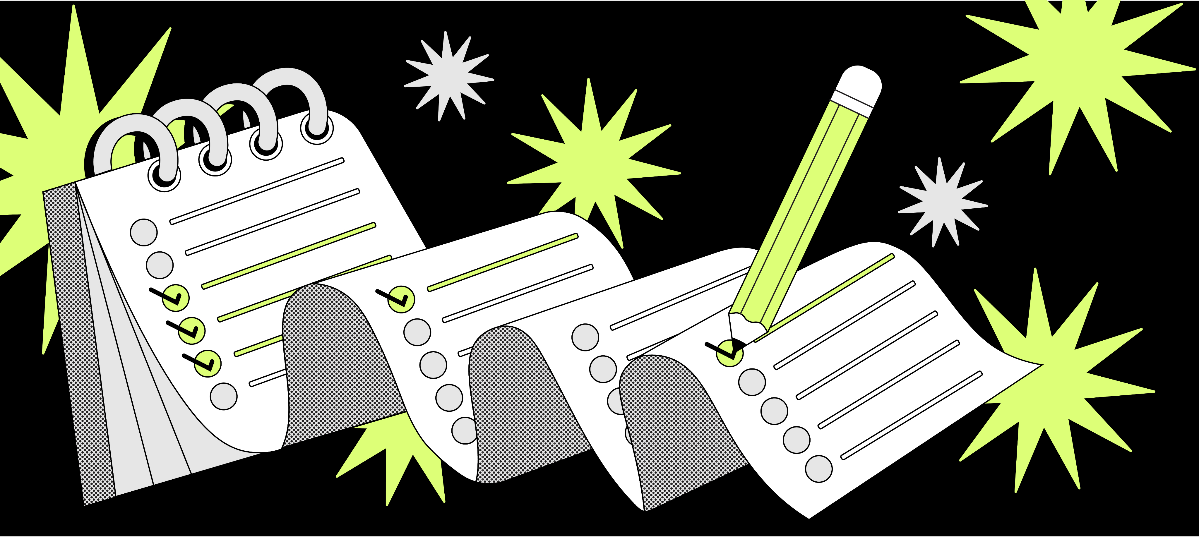
Below are the four pit-stops that keep us in lane:
1. Why "more" isn't always "better" - the moment exta creativity
start to hurt.
2. The research backing focus - numbers that prove consistency and precision make money.
3. Knowing you've hit "good-enough precise" - clear stop signs.
4. A hands-on recipe - tool n tips for blendin creativity with project management.
Why “more” isn’t always “better”
Two months ago we were on round #4 of tweaks to a finance client’s brand guide: animating the logo, swapping gradients, adding a third drop-shadow.
Every “tiny change” burned out-of-scope studio hours—and, worse, blurred the core message.
What saved us? Precision Design
A mindset that fences the project into 2–3 visual elements and one laser-sharp message.
Precision Design
less, but nailed: lock the anchor colour, typeface and symbol that embody the brand’s heart—then repeat them everywhere. With that mini rule-book, design, marketing and dev teams ship faster, dodge endless revisions and deliver a brand experience that’s copy-paste consistent.
Oatly
Why it pops? Vegan milk that feels punk; you spot it in one glance.
How Precision Design shows? Shouty black type + oat-cream background,
zero extra graphics
wise
Why it pops? Instantly recognisable in fintech feeds;
projects low-fee transparency
How Precision Design shows? Mint-green anchor colour,
two-tone arrow icon, utilitarian mono type
Notion
Why it pops? Users recolor the app, yet the brand never hides.
How Precision Design shows? Black “N” cube, monospaced type, monochrome UI.
Common thread
- Tight palette—one hero color works in print and pixels.
- Single mark—easy to clone into an icon, button or box.
- One font—no “maybe we’ll add handwriting”.
Small brands get big-brand recognition, speed and budget control—thanks to Precision Design.
Numbers that back the less-but-precise rule
- Design Council 2023: Focused brands average an 11:1 return on every $1 spent on design.
- Nielsen Norman 2022: 45 % of users bail when an interface is over-decorated.
- Bottom line? Fewer elements → sharper message → calmer budget.
2. The data that shows consistency pays
Wondering if the maths really supports minimalism?
Check these:
- Lucidpress 2024 – full brand consistency
lifts revenue by 33 % year-on-year. - McKinsey 2023 – firms that push creative excellence clock
18 % annual growth
vs. 9 % for the rest. - Sprout Social 2024 – 82 % of consumers need brand trust
to purchase;
a clear logo + unified look buy that trust in the first second.
Short version:
A tuned-up process beats random polishing—and pays for itself.
3. Signs you’ve hit “good-enough precise”
Stopping on time is a management decision, not a hunch.
Watch for:
Stop sign:
1. The 3-second test;
Users grasp brand values instantly—great clarity.
2. One signature;
CEO / CMO signs the Brand Guidelines—loop closed.
3. Favicon pass;
The tiny app icon is still legible—the logo stands alone.
Quick tip:
Adobe 2025: slimming to a minimal logo boosts brand recall by 15 %.And Gartner 2024 notes only 24 % of CMOs feel they have enough strategic branding budget—so stopping is strategy, not surrender.
4. A practical recipe for creativity + control
Step / Action / Why it saves you?
Fixed decision gates
Sketch → first draft → final lock.
Kills the revision hamster-wheel.
One-pager guidelines
Colors, fonts, dos & don’ts.
Nips ad-hoc tweaks later.
Semi-auto tools
Adobe Firefly 2025 = +81 % creative productivity
Budget goes to marketing, not pixel-pushing.
Single client lead
All feedback through one person
No “pretty / ugly” stand-offs.
When ROI shakes hands with creativity
Branding isn’t just pixels—it’s strategy. Stunning visuals are great, but Precision Design inside a clear workflow—research, focus, a single sign-off—drives real ROI.
Forrester 2024: companies with design KPIs that release on time see +25 % digital performance in six months.
Need help deciding when to press on and when to park it?
Ping Peanuts Studio and we'll figure out what’s “good enough” for your brand.


